

Whether you consider yourself a reader or not, on any given day we read COUNTLESS amounts of text, from news articles to road signs. We read so many different kinds of text that it’s easy to assume the font of that text doesn’t really matter. What’s the difference between a billboard written in Century Gothic verses one written in Stencil? After all, you’re reading the same words, right?
Wrong! In fact, even your go-to typeface options like Times New Roman and Calibri can provoke different emotions and meanings depending on the context.
For example: Take a look at these three Jack O’ Lanterns…
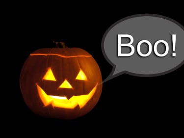 Jack O’ Arial
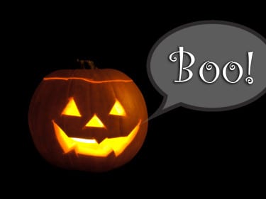 Jack O’ Curlz MS
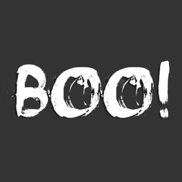
 Jack O’ Face Your Fears
The first, whose “Boo!” is written in Arial, comes off as lighthearted… almost childish. And, while you could say the second font is also lighthearted, Curlz MS manages to put you into more of a Halloween mood with its… well, “curlz”. The font in the final image not only catches your attention, but the aggression behind it might even make you feel a little uneasy. Fittingly, this font is named Face Your Fears!
So heed our warnings this Halloween… even though these different fonts say the same thing, they say it differently. Typeface is important. Make sure yours fits the mood and message you are trying to get across… or else!