

With the increased use of mobile predicted for the future, you may be wondering “how will this effect my website?” Responsive Website Design is the solution. You might be thinking, what the heck is that? Well, its meaning is totally not techy. It means the images and content on the page will resize/reconfigure and looks great on all devices: desktop, tablet, mobile, laptop, etc. In the long run, this will make your business much more productive and profitable.
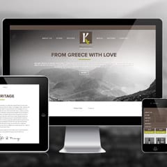
Kasandrinos, a responsive web design site that Mindspike Design built, is a great example of how this looks.
As you can see, the images/layout adjusted with the device. This ensures an easy read and navigation, no matter where you’re viewing it!
So what’s our secret? It’s no magic trick. Your site needs these things: fluid grids (like percentages that adjust exactly), flexible images (they should look crisp when big or small) and media queries (a spiffy way of saying your site can tell how big or small the viewer’s device is).
To prove the importance of Responsive Web Design, it’s predicted that by the year 2015, more than 70% of people will access the internet primarily through their mobile device (world wide). So, if your desktop website isn’t optimized to view on mobile, the consumer won’t be able to view it, or even worse, won’t find your site at all. This could mean A LOT less business.
Responsive Web Design is fairly new and can be expensive, so do your research when looking for a website developer. Make sure the designer can not only explain to you what responsive design is, but can also show you some solid examples of work they’ve done. Some websites can do without responsive design (for the time being), but let the expert help you decide that. It could be more expensive in the long run if you have to rebuild your entire site.