The end of the road! Dead end! Nothing to see here! End of the line! You broke it!
The 404 page is the internet equivalent to all these terms. But what exactly is a 404 page?
When somebody enters a URL of your website that does not exist, they will find themselves on your 404 page. In a perfect world, people would never end up on your website’s 404 page, but for one reason or another, people find themselves seeing the dreaded 404 all the time.
Unfortunately, the broken link page is often overlooked by website developers. The average 404 page is harmless and includes a basic message instructing you to navigate back to a different page on the website.
However, a broken link page is an opportunity for your business to make an impression with a visitor. Think of it as a way to add an extra branding touch to your website, while having a little fun at the same time. An eye catching design, funny image, or even an animation can help a lost website visitor navigate to your homepage instead of looking elsewhere on the web.
The following are some imaginative 404 pages we can’t get enough of.
Bloomberg

Bloomberg.com’s https://www.bloomberg.com/ tops the list because of its combined use of humor and video. The video shows a CGI animated man getting frustrated with his PC and slapping it to pieces, only to meet a similar fate. The message is over the top but for a site known for serious business news, it’s refreshing they have such sense of humor. Although we’d hope cooler heads will prevail when visitors get a 404 message on their computer.
We love the simplicity of Google’s 404 page. It’s message is clear: you have a 404, it’s an error, your page isn’t here, and that’s all they know. The poor, self-built robot that can’t find its missing parts conveys the situation in one simple graphic.
Nouveller.com

Only film geeks who love the hit film “Jurassic Park” will appreciate the 404 page of Nouveller.com, created and maintained by Benjamin Reid. The site’s error page mimics the pivotal scene when Nedry, Jurassic Park’s nefarious IT guru, hacks the system to prevent access to the parks’s control systems. Like in the movie, a window for the “Central Park Control Console” informs visitors that Jurassic Park’s security system is offline. A cursor flashes, awaiting commands, and replies with “permission denied” to anything that is typed into the box. Once access has been denied a few times, the film’s iconic “You didn’t say the magic word” prompt will appear.
GitHub

GitHub’s 404 is geeky, cute and simple, cleverly using Obi-Wan Kenobi’s memorable line from Star Wars. There’s also some light interactivity (the objects in the foreground move along with the mouse) to make this enjoyable 404 page something beyond the ordinary.
Blue Fountain Media
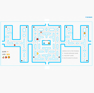
Some visitors might consider a 404 page a waste of their time, so it’s a nice tradeoff to give them one that’s a time waster. The 404 page for Blue Fountain Media created a playable version of the classic Pac-Man arcade game in the page’s “404” title. Creating a 404 page like this means that you might have visitors intentionally getting errors on your site!
Huffington Post

Clutter free and simple, The Huffington Post is an instant Internet win for featuring the words “Oh, Noes!” and cute pets. But wait, there’s more! Every time you land on the page there is a new image of a cute pet. What a great way to turn a frown upside down.
404 Page Tips
Developing a fun 404 page is always recommended, but it’s important to keep it practical. Here are some tips for creating a 404 page for your website.
Provide some support: Make sure you are explaining what’s happening, in layman’s terms. Inform your visitor that it’s not their fault that they wound up on a broken link, and let them know how it might have happened. Most importantly, make sure they have channels to continue browsing your site.
Give them options: Present visitors with options to move forward with the error, with a direct link to the home page or a search bar to find what page they might have been looking for. Also, providing links to popular pages on your site is a great method for making lemonade out of lemons.
Give it a proper design: Your 404 page should be somewhat consistent with the look and feel of the rest of the website. With proper execution, a successful 404 page should be a portal that gives information to visitors while providing new channels to explore your company information. It’s also a great opportunity to showcase engaging content such as animation or clever graphics.
Check out more of our website and graphic design tips by visiting the Mindspike Design blog, or feel free to reach out to get to know us for yourself.


