


It’s amazing how impactful negative space can be. Imagine, for instance, staring up at a clear night sky, or standing on a huge stage facing an empty theater. Growing up, negative space always seemed, well, negative! Think about that My Little Pony coloring book page your niece made you… the entire page had probably exploded with crayon! Or can you still remember the first time you were allowed to decorate your own bedroom? 50 posters of your favorite band was definitely more than enough.
In art and design, negative space describes the area around an object, or the empty space on a canvas. Many people will tell you that when composing a graphic, photo or other design the ratio between positive and negative space should be equal because it is most pleasing to the eye. Others will tell you that too much negative space is wasted space. At Mindspike, we believe there are actually a few vital positives that can come into play when incorporating more negative space in your designs.
1. Crafts a sense of balance

Many companies have logos that incorporate negative space. Eaton Corporation is a great example. The mind automatically fills in the blanks, creating its own sense of balance.
2. Gives the object more attention & more energy
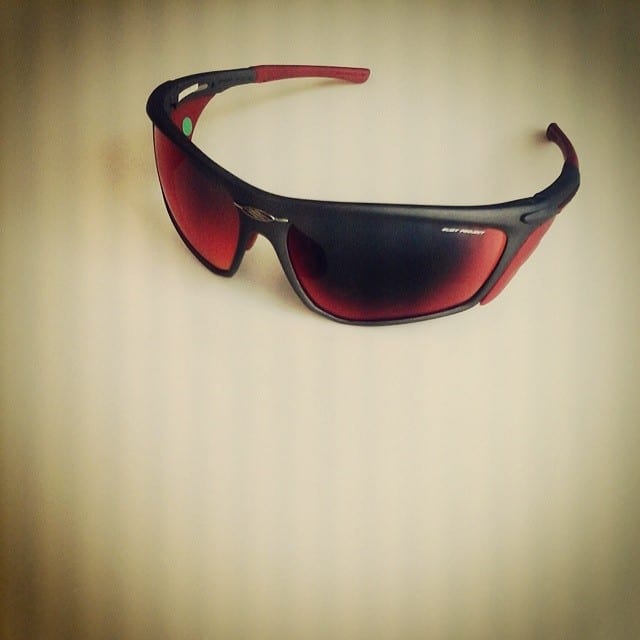
Even though the sunglasses only take up a small part of this image, your eyes are instantly drawn to them.
3. Creates an alternative perspective

Is this image of foam in a Cappuccino, or a beautiful fern?
Negative space might leave a blank canvas… but that doesn’t mean it can’t have a powerful impact on an audience.