


We at Mindspike are always looking to the future and the impact device choices of website visitors are having on web design. Although there have been arguments that web design is becoming more of discipline of user interface design, due to the continued growth of mobile devices, we have also been pushing our web design projects to be more progressive with upscaling our responsive web designs, to allow for a full screen experience with desktop users, who have increasingly turned to using larger screens as prices for flat screen monitors continues to shrink.
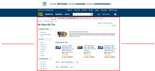
Often responsive web design means that the design of the website shrinks to small form factors, like mobile phones or tablets. However, there still is a large array of screen sizes being used on desktop workstations that needs to be contended with. Often in the past, there was a screen size average used to create web page designs with set dimensions, the “fixed-width” website layout. There’s still a dizzying amount of very popular websites that utilize the fixed width layout. Unfortunately, these website’s do not scale very well. Consider the layout of Best Buy’s website. On a massive screen, there presentation of their products is limited and lacks impact, with huge amount of wasted whitespace on both sides. The layout does not change based on resizing the browser window, instead it sets a maximum width it constrains content elements within.
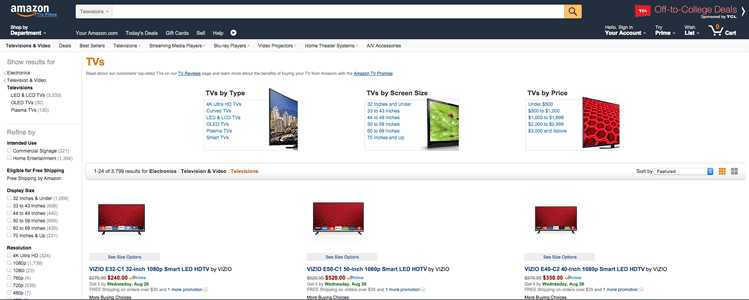
Conversely, there was the ‘variable-width’ website layout. Originally, this was denote a website layout that adjusted to both large and small desktop screen layouts. This terminology is now outdated but the same technique is applied to modern responsive design – the site’s design elements adapt to the changing screen sizes. Amazon uses a variable width layout for its site, and maximizes the amount of products it displays per page.
Our recent website design projects for clients have been designed to maximize the upscaled responsive experience. Starting with creating the layout with a width exceeding 2500 pixels wide, we program the website’s HTML and CSS to dynamically resize the graphics based on the browser, or viewport, being resized. These breakpoints also dictate how the design elements react – if they flow, stack or are hidden – based on the changes of the screen width.

This presentation makes for a huge impact with visitors. The graphics and photography demand attention due to their quality and fidelity. Call to action elements such as text, buttons and other design assets become more clear to visitors. All of this comes from taking full advantage of the canvas presented to our designers and web developers.
Scaling these larger elements to a small screen is a feat only the most skilled web designers and developers can accomplish. We are always careful to treat the downscaling of these elements as to not corrupt the full-sized design vision. Consequently, our mobile device web design is very complimentary to our full sized layout.
Not matter your audience, making sure your website appreciates devices of all sizes is important. Although the trend is making sure responsive design caters to the smallest of layouts, we argue not ignore web users with increasing large screens and pixel density. Size does matter after all…